The Challenge
To create a responsive web-app that will motivate people into an exercise routine that suits their level, schedule, and interests.
What Were My Initial Goals? What Problem Needed Solving?
Take a moment and think about exercise, routines, and goals. For someone new to exercise, or new to taking their physical fitness seriously, the tasks of finding a routine, knowing how to do exercises correctly with proper form, and scheduling workouts can seem extremely daunting. Fitted was designed to bridge that gap and help motivate its users into healthier more sustainable workout habits. For Fitted I took on the role of the primary UI designer.
The Process
My process for the creation of Fitted followed a Discovery, Building, and Finalization Phase. The Discovery Phase was all about my users. In taking on a primary designer role, much of the discovery phase was already completed for me prior to beginning the project. Fitted's brief laid out a persona, user stories, and the 5 W's (who, what, where, when & why). The Building Phase is really where I dove into the project through sketches and wireframes. The Finalization Phase took the prototypes that I had created and gave them final polish with finishing touches.
Discovery
After combing through the brief I was able to get a good snapshot of who the primary users of Fitted were eventually going to be: "People who are new or returning to fitness, want to find activities they like, and get into a good routine will be interested in Fitted." Meet the Primary Persona for Fitted - Rebecca!
In order to get potential ideas for the look and feel of Fitted's UI, I moved to the creation of a Mood Board next. I knew that the design of Fitted needed to be straightforward for new users, not overbearing on colors, and be kept simplistic and sleek.
Mood Board:
Building
Next I implemented and built a Sitemap and User Flow that made sense for pathways through the app. It is follows a simple structure, but stays direct - exactly what I wanted Fitted to be for my users.
Sitemap Sketch:
While working on the Sitemap and User Flow I knew Fitted needed to include these features to be successful:
1. A Splash / Home Page
2. A way for a returning user to login and/or a new user to setup an account
3. A homepage for users to access information
4. A menu for quick site navigation
4. A way to filter and search for exercises
5. A way to schedule exercises
6. A way for users to track progress via gamification
7. A social aspect to the app
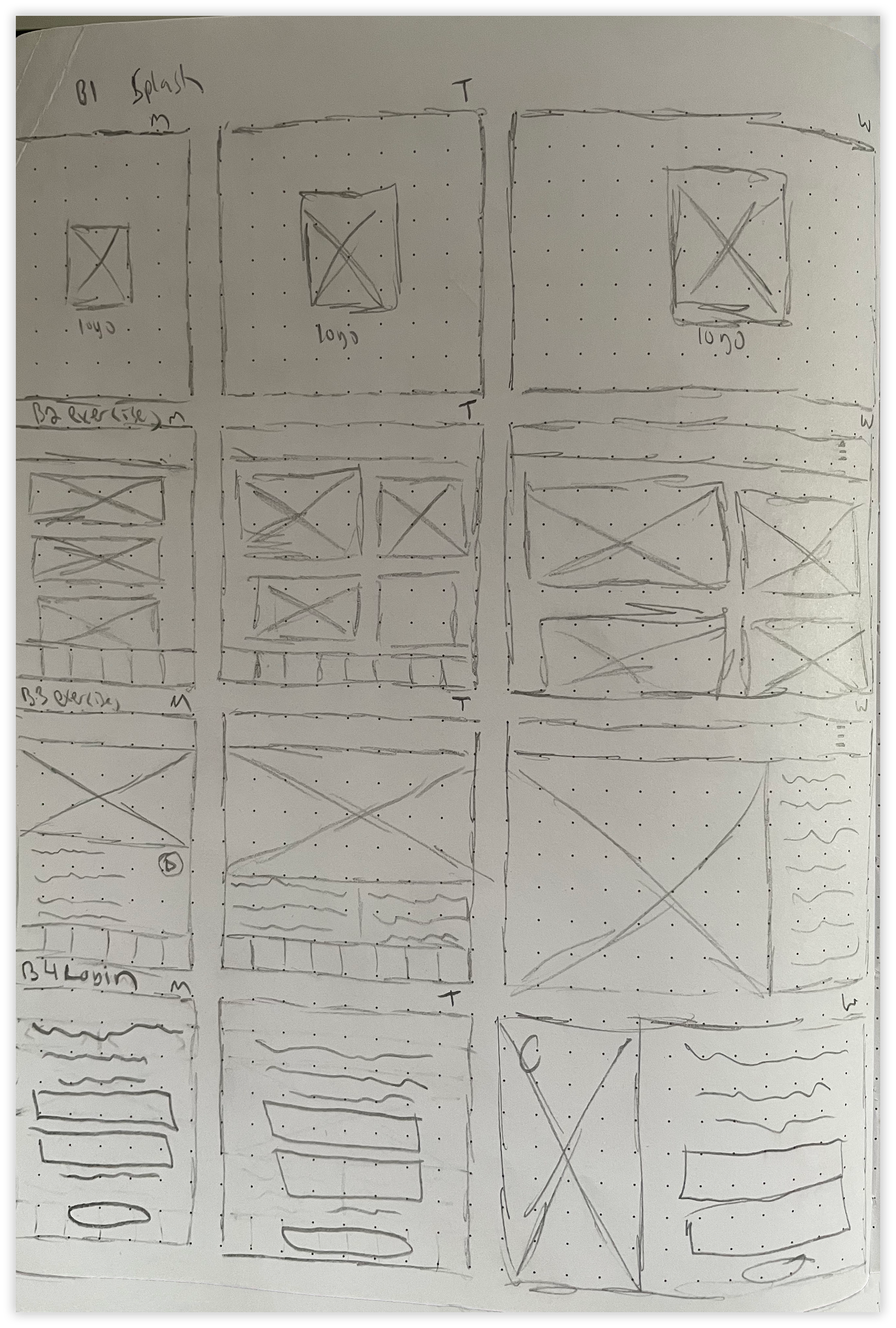
With these in mind, I then moved to the prototyping phase, beginning with sketching possible screens. Along with doing mobile sketches, I also began to think about breakpoints and how my designs for screens would translate from Mobile > Tablet > Web.
Mobile Screen Sketches and BreakPoints:


As I transitioned into digital I kept a few key points in mind to carry through the app. These points were not only to help differentiate Fitted from all the other fitness apps out there, but more importantly keep the user's engaged fully. I kept these main attributes in mind while transitioning:
These three key points guided my way as I began in on Low & Mid-Fidelity Mockups.
Low-Fidelity Mockups:
Mid-Fidelity Mockups:
Color Theory:
As the design and screens began to develop I also settled upon a Dark Color Palette. The Color Theory behind the chosen palette was both for accessibility and to keep the interface as easy on the eyes as possible.
Corvette Red #D82727: Conveying power and passion, it is said that the color Red has the ability to boost metabolism and carries the weight of importance... Perfect for a Fitness App! I utilized Corvette Red as a powerful accent color.
Space Grey - Light/Medium/Dark #2F2F2F, #414141, #8E8E8E: Grey conveys meaning of being both formal and modern. The three hues of gray ranging from light to medium to dark, are utilized throughout the design as a secondary color for accent items, navigation bars, and pop-outs.
Noir Black #000000: Is generally associated with elegance and sophistication. Black is utilized as a main background color letting the lighter shades used throughout jump off the screen and be easily visible to the user.
Ghost White #FFFFFF: Conveying virtue and cleanliness, White is used throughout the app as a main text color, rule divider color and as the main stroke around the image boxes.
When used in conjunction, the Fitted color palette is sleek, mysterious, elegant, and modern all while keeping ease of view at the forefront for its users.
Finalization
High Fidelity Final Mockups & Breakpoint Designs:
Fitted's branding is all about simplistic fun. The motifs of motivation / progress / goals are carried through the application via the imagery of the muscular flexing arm and in the Dark Color Palette. The Fitted Logo also plays off of this idea by combining a "F" with an muscular icon. Special thanks to the free vector source Vecteezy for providing the initial arm illustration.
Fitted Logo:
As I did with PlutoPay, I also combined all of Fitted's Design Language into a polished brand book. Using the same style layout for consistency, it was a great way to showcase everything I have completed for the project.
Fitted puts its users at the forefront, always. Through an extensive exercise library, the ability to filter, search, view videos, track, log and earn badges, the application keeps fitness fun for anyone regardless of exercise level. It is sleek, modern, inclusive, and helps its users attain whatever goal they have set out for themselves. In beginning the design for Fitted, it became the perfect catalyst for a love of pixel perfect UI. The project would not have been possible without free license images and icons. Special thanks to all that made the project a reality.
