The Challenge
To create a responsive web-app that will allow anyone to shop, transfer money, and more without a debit or credit card or the need to visit a physical bank or store.
What Were My Initial Goals? What Problem Needed Solving?
Think for a second how many separate apps you have or use for all of your monetary assets. Bank apps, investment apps, crypto apps, the list runs on and on! Currently there is no easy way for users to send and receive money from their friends that ALSO houses their digital coins and stock / savings investments. Think like an all encompassing wallet... but better. That is what I set out to create.
The Process
My process for the creation of PlutoPay followed a Discovery, Building, and Finalization Phase. The Discovery Phase was all about my users, doing extensive research and getting to know them at their core - their wants and their needs. The Building Phase took all that I had learned in the Discovery Phase and transitioned that into sketches and wireframes. The Finalization Phase took a more desigmernly approach putting the finishing touches on the prototype.
Discovery
I began my Discovery process with a Competitive Analysis. Currently there are a quite a few money management applications out there - I chose Venmo and PayPal to analyze since generally they are the two most popular. I also did a SWOT Analysis on both to get a feel for strengths, weaknesses, etc. In analyzing these competitors, I found ways to make my eventual PlutoPay app better.
Surveys, User Interviews, Mental Models & User Journey's were all used to discover what potential users could use and benefit from while using my application.
My Research Goals for my interviews revolved around three main ideas:
1. Let's see how do users prefer to manage their money when it comes to tracking and budgeting.
2. Let's better understand the needs of a user that sends or receives money online.
3. Lastly let's outline from a user's perspective competitor’s issues I can hope to fix with my app.
Three Potential Users Were Interviewed:
After an extensive process, I then chose to design for two Primary Personas, based off of all my interviews and user research. Meet Chris and Charlotte!
Mental Models came next. I used the models to document a user's journey through a process, along with all the emotions felt along the way. They were a nice visual way to see how my two personas would feel completing specific processes.
Mental Models:
Building
Taking all of the data I had compiled so far, next I implemented and built a Sitemap and User Flow that made sense for pathways through the app. It is simplistic, but direct - exactly what I wanted PlutoPay to be for my users.
Sitemap:
While working on the Sitemap and User Flow I knew PlutoPay needed to include these features to be successful:
1. A Splash / Home Page
2. A way for a returning user to login and/or a new user to setup an account
3. A homepage for users to access information
4. A menu for quick site navigation
4. A way to send money to or receive money from a friend
5. A form of security to authenticate actions
6. A way for users to filter past behavior
7. A budget / goal setting feature
Time to Prototype!
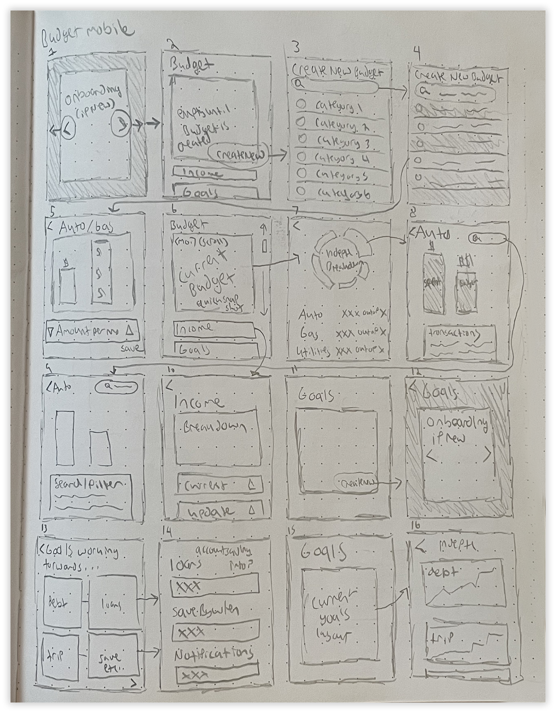
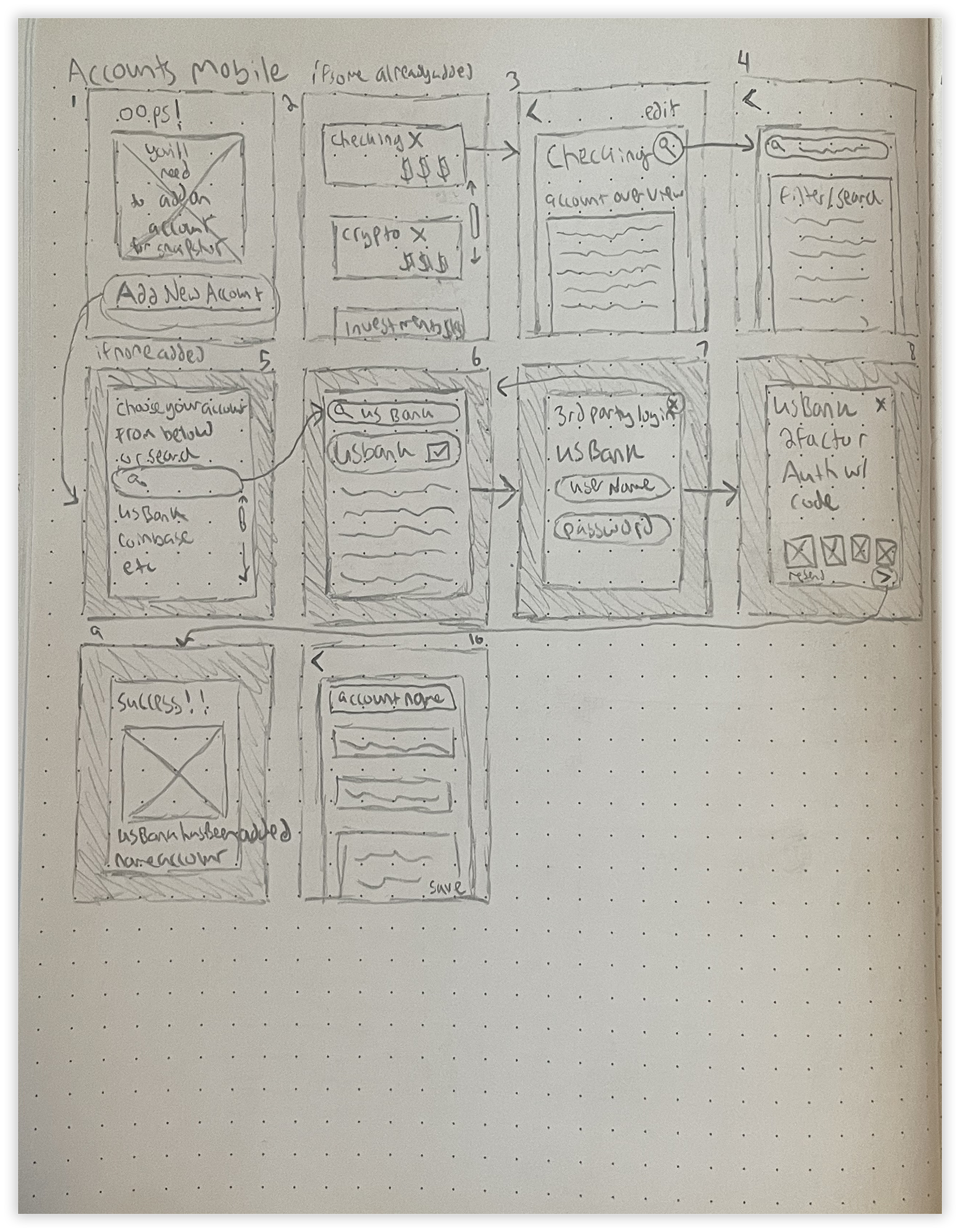
Sketching is my personal favorite part of any design process. Originally wanting to do illustration full time, sketching in pencil and paper is the best way for me to get out all the ideas for layouts that I possibly could.
Various Screen Sketches:


As I transitioned into digital I kept a few key points in mind to carry through the app. To not only differentiate PlutoPay from all the other money management apps out there, but more importantly keep the user's engaged fully I kept these three points in mind while transitioning to digital:
With these three key points lighting the way I began in on Low & Mid-Fidelity Mockups.
Low-Fidelity Mockups:
Mid-Fidelity Mockups:
As the design and screens began to develop I also decided upon a sleek Dark Color Palette.
Finalization
High Fidelity Final Mockups:
PlutoPay's branding is all about a simplistic, interconnectivity. The motifs of the galaxy / space are carried through the application via the imagery and in the dark color palette. The PlutoPay logo also plays off of this idea by combining a "P" with a planetary icon.
PlutoPay Logo:
Coming from a print design background, I also compiled PlutoPay's Design Language into an all encompassing brand book. It was the perfect way to combine everything I've learned thus far as a Print Designer with everything I've learned thus far as a UX Designer.
Not only does PlutoPay allow users to transfer money, it also allows them to see their money as a conscious entity. It shows them their goals, current amounts, and helps them to confidently manage better. This project is the culmination of all I've learned about UX thus far and would not have been possible without free license images and icons. Special thanks to all that made the project a reality.
